


The best law firm websites are the ones where a nervous person with a legal problem can tell within five seconds that this firm handles it, trusts them enough to make contact and can do so with one tap. I looked at twelve law firm websites that keep appearing on the design round-ups, visited each one and judged them on that standard rather than on colour palettes. Here is what each one gets right, what it costs them and which ideas transfer to a small firm with a smaller budget.
Two notes before the list. First, I have no connection to any of these firms; they were picked from the lists that rank for this search, then checked on a phone. Second, “converts” means produces an enquiry from someone who did not know the firm. A site can be beautiful and fail that test, and several beautiful ones do.
- Six structural features make a law firm site convert: one-tap contact, a page per practice area, proof, a numbered process, a FAQ in the client’s words and honesty about money. Design is not one of the six.
- Of the twelve sites reviewed, eight put contact above the fold and eight have a page per practice area. Only three publish fees.
- The right amount of selling depends on how long the client takes to decide. A criminal defence site and a commercial litigation boutique should not look alike.
- Speed is the minimum. Several award-listed sites lose the enquiry to a four-second load on a phone.
- A small firm should fix contact placement first, practice-area pages second and reviews third, before spending anything on design.
What I judged them on
- Clarity in five seconds. Practice areas and location visible without scrolling.
- One-tap contact. A phone number or booking link above the fold on a phone, not buried on a Contact page.
- Proof. Reviews, results or case history, presented so a stranger believes them.
- Plain language. Written for the client, not for other lawyers.
- One page per practice area. So search engines and clients can tell the matters apart.
- Honesty about process and money. Which almost nobody manages.
1. Roulston Urquhart Criminal Defence, Calgary
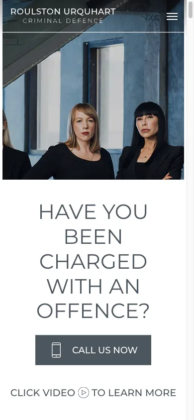
The first thing on the page is “available 24/7”, a Call button and a Message button. Then a video, then three numbers (courtroom hours, clients helped, years of experience), then a grid of every charge the firm defends, each with its own page. For criminal defence this is exactly right. The person searching is in trouble now and on a phone. They need to know someone will pick up. The “first steps when facing a charge” section answers the question the client is actually asking before they call. The only thing I would change is the volume of text further down the page, which is written for search engines more than for people.
Steal this: the 24/7 line with two tap targets, and one page per charge.
2. YLaw, Vancouver
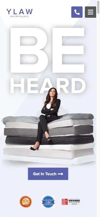
A family and employment firm that publishes every lawyer’s hourly rate on the home page, from the CEO down to the articling student, and explains why the first consultation is paid rather than free. That is rarer than it should be, and it filters enquiries before the phone rings. The site also lists the nine languages the firm works in, three office locations with a booking link each and a run of case victories written as short stories rather than citations. Reviews are quoted in full. It is a long page, but every section does a job.
Steal this: publish your rates, explain your consultation policy and list the languages you actually speak.
3. Naqvi Injury Law, Las Vegas
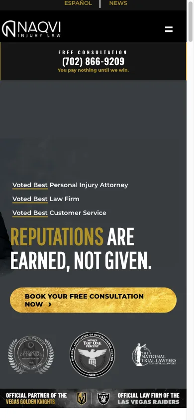
Personal injury is the most competitive legal market there is, and this site shows what the winners do: settlement figures above the fold, each tied to a case type, a “book your free consultation” button before anything else, named client video testimonials and a founder bio that leads with the one fact that matters to an injured person, that he used to work for the insurance companies. It is loud, and a boutique commercial firm should not copy the tone. It should copy the structure: proof first, contact second, everything else after.
Steal this: lead with specific results you are allowed to publish, and put the client’s face on the testimonial.
4. Rasa Legal, record clearance
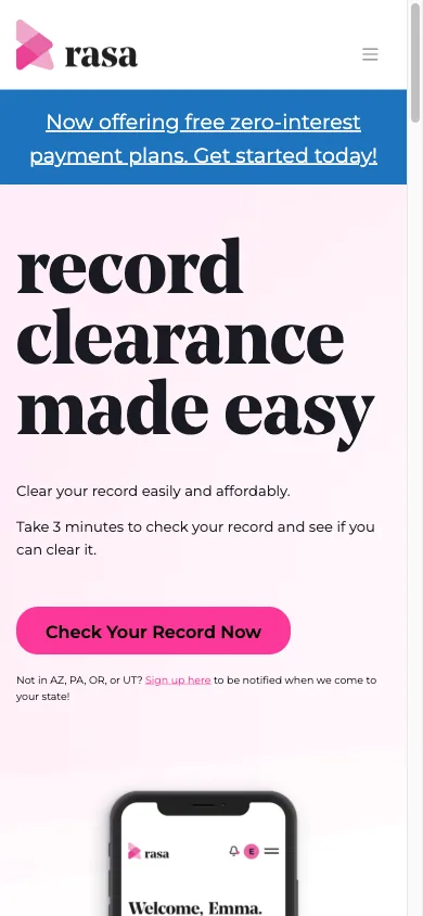
It is a law firm, but the site works like a product. The home page offers a three-minute eligibility check, states the price of the legal review, shows how many people have used the tool and how many records have been cleared and lays the process out in four numbered steps. The FAQ answers the questions a nervous person asks, including “what is the difference between Rasa and a traditional law firm”. Most firms cannot productise their work this far, but every firm can borrow the numbered process and the price of the first step.
Steal this: a numbered “what happens next” and a stated price for the first step.
5. Bend Law Group, San Francisco
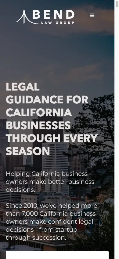
A business law firm that organises its services by the client’s stage (build, grow, scale, protect) instead of by legal category, and offers a five-minute assessment as the main call to action, with a plain “contact us” for people who already know what they need. The founder’s reason for starting the firm is on the home page in the first person. There is a 200-review count, a FAQ written in the client’s words and a line most firms will not write: if we are not the right fit, we will say so and refer you. The page is long, and on a phone that costs it some speed, but the structure is the best on this list for a firm selling to business owners.
Steal this: organise by the client’s situation instead of by your practice areas. Give the undecided visitor a low-commitment first step.
6. White Oak Wills & Trusts, Portland

Estate planning is a matter people postpone, and this site is built to lower the barrier: “Schedule free consultation” and “Call now” side by side under the headline, three short client quotes immediately under them, then the lawyers with real biographies, then the practice areas as a checklist, then a six-step process. A downloadable handout states the fees. The FAQ includes “why can’t I just use AI to draft my will”, which is the question clients are asking in 2026 and almost no firm answers. The hours and address are at the bottom in plain text, which is what Google reads when it checks the Business Profile. The catch is on a phone: the first screen is the hero photograph alone, and the headline and both buttons sit one scroll down. On a desktop they are visible at once. It is the clearest example on this list of a site designed on a monitor and never checked on the device its clients use.
Steal this: answer the objection of the year in your FAQ, and put the fee information somewhere a visitor can find it. Avoid this: a hero image that pushes the contact buttons off the first screen on a phone.
7. HagEstad Law Group, Montana and Arizona

A two-state firm with four practice areas, and the home page says all of it in one screen: who they help, the four areas, a free consultation button and the numbers. Review counts from several platforms sit together with quotes under them. Each state has its own phone number, which matters for the map pack. The lawyer section lists where each is licensed and what they specialise in, which is the first thing a careful client checks. The page repeats its statistics twice, which it does not need to, and the disclaimer about attorney-client relationships is exactly where it should be, next to the form.
Steal this: a phone number per office, and licences and specialisms on every lawyer’s card.
8. Tremain Artaza, employment law

The opposite of Roulston Urquhart: very little text, calm imagery, two sentences about what the firm does and for whom, plus one decisive feature: a “schedule now” link that books the consultation in one step with no call back. On a phone that link sits one scroll down, under the press logos; the first screen offers only “learn more”. For an employee who has just been fired and is embarrassed to phone a lawyer, removing the phone call from the first step is the right design decision. The press logos do the proof work. What the home page lacks is practice-area detail, which lives on inner pages and makes the site weaker in search than it is in conversion.
Steal this: let people book without calling, if your clients are the kind who dread the call.
9. Counsel for Creators, Los Angeles
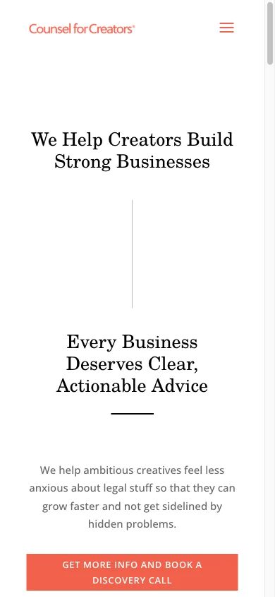
A niche firm for creative businesses, and the niche does the work. Four services as cards, a four-step process, one testimonial, a blog that answers the questions creators actually have and a “book a discovery call” button repeated three times. The legal subscription is the interesting part: a monthly plan for ongoing access, which is a model more small firms could offer and almost none advertise. The site is light on proof beyond the single quote, and a second or third review would cost nothing.
Steal this: name your client type in the first sentence, and consider a subscription for the clients who need you every month.
10. Law Office of Stacey-Ann Taylor, Atlanta

A solo trademark and small-business practice that writes in the first person, to a specific reader: the Atlanta business owner who needs to protect a name. The title tag says the city and the practice. The opening paragraph says what the problem is, who the client is and that the firm will take them whether they are new or twenty years in. It is one of the few sites here where the copy sounds like a person, and that is the conversion feature. It would convert more with a booking link above the fold and a review or two on the home page.
Steal this: write the home page in your own voice to one specific client.
11. Bick Law LLP, California
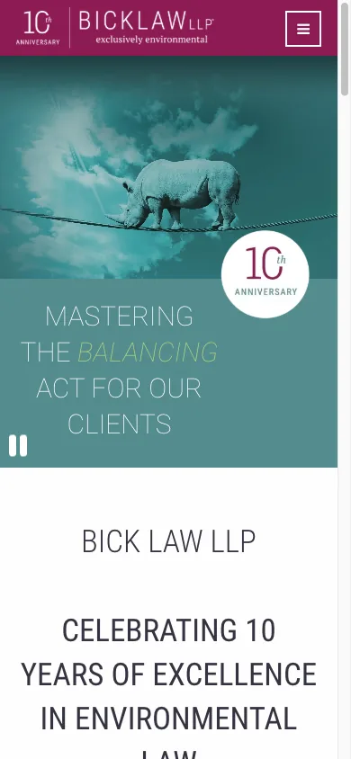
An environmental litigation firm whose entire home page above the fold is one paragraph saying what it does, for whom and at what level. There are no calls to action in that first screen and no proof, which for a consumer firm would be a failure. For a firm whose clients are general counsel at companies facing environmental claims, it is a deliberate choice: the reader is going to research the firm for a week before calling, and the site is built for that research. The lesson is that the right design depends on how the client buys, and a business litigation boutique should not copy a personal injury site.
Steal this: match the amount of selling to how long your client takes to decide.
12. Setia Law, Singapore
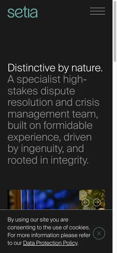
A disputes firm whose home page leads with its latest published analysis of a Court of Appeal judgment. That is the whole conversion strategy: demonstrate expertise in public and keep doing it. Let referrers and in-house lawyers find the firm through the writing. It will never win “lawyer near me” and it is not trying to. For a commercial firm whose work comes by referral, a steady insights page with real analysis is worth more than any amount of home page design, and this site is the cleanest example of that on the list.
Steal this: if your clients are sophisticated, publish real analysis and put it first.
What the converting ones have in common
Notice what is not in the table. Animation, custom photography, a video in the hero and a bold colour scheme each appear on some of the best sites here, and none of them is what makes the site convert. They make it memorable, which is a different and smaller job. The three sites that publish money (YLaw, Rasa, White Oak) are also three of the four with the clearest process, and that is not a coincidence: a firm that is willing to say what the first step costs has usually thought about what the first step is.
Where the numbers come from
4 outside sources · 1 from my own work
- Method
The twelve sites were selected from the lists that rank for this search in October 2026, and I visited each on a phone and a desktop on 13 October 2026.
My own work - Method
Observations describe what was visible on the home page that day.
Outside source - Method
Sites change, and 99creatix has no relationship with any firm listed.
Outside source - Method
Load-time remarks are from a single mobile test and are indicative only.
Outside source - Method
Screenshots show the first screen of each home page at phone width (390 pixels), captured on 15 October 2026.
Outside source
What a small firm should copy, in order
- Put the phone number and a booking link in the first screen on a phone. Check it on your own phone, not on a monitor.
- Give every practice area its own page with its own title, written as a subject. This is also the change that moves search rankings most, as it did for a UAE law firm I worked with, whose average position went from 26 to 9.
- Put three real reviews on the home page, with names where clients allow it.
- Write a numbered process: what happens after the call, in four steps.
- Answer the six questions every first call includes, in a FAQ, in the words clients use.
- Decide what you are willing to say about money, and say it.
Then make the whole thing fast. Several sites on this list take more than four seconds to load on a mobile connection, and every one of those seconds loses the person who was about to call. Speed is the minimum every site has to meet. How I build law firm sites to meet it, with one page per practice area and intake built for phones, is on my web design and SEO for law firms page. If you are deciding what to fix yourself first, the order above is the one I would follow, and the search side of it is in SEO for small law firms.